“All wood is brown isn’t it?” Well no, according to Simon Pirie, the designer and founder of Simon Thomas Pirie it really doesn’t have to be. Nowadays there are all sorts of options to bring the natural, tactile warmth of timber together with the vibrancy, contrast, or in some cases subtlety of colour. Despite a life-long love of working with timber Simon is the first to admit that too much wood, used the wrong way can leave a space looking mono-tonal and frankly rather bland…
“When we open our showrooms we use colourful objects and paintings to bring the furniture to life as roomsets. We are also increasingly using colour on and in the bespoke furniture we design to add a new dynamic into it, if anything this enhances the natural wood tones. The limits of what wood can be become pretty limitless.”
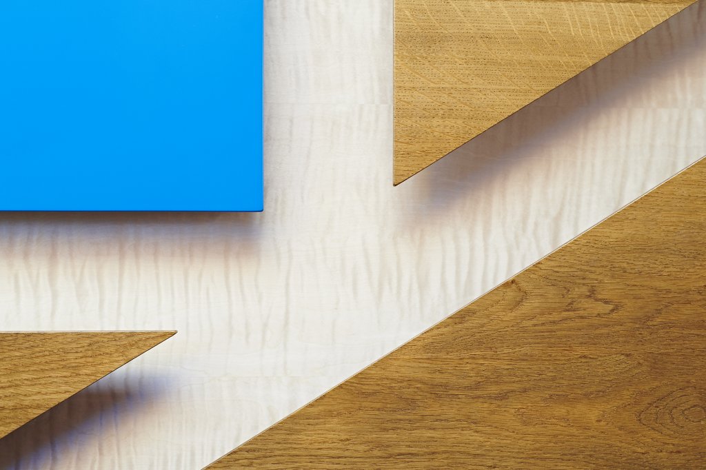
Contemporary stair panelling for Bliss project in Norfolk. Dyed pink ripple sycamore, bright blue lacquer and solid fumed oak panels.
Here at Simon Thomas Pirie, we make furniture: big furniture, small furniture, fitted furniture, stand-alone furniture. Many of our recent projects have been whole room designs and these have included kitchens, living rooms, studies and bedrooms. With these we have been becoming more and more involved with the world of interior design; in some cases working with interior design practices and in others working directly with the client and taking on more of that role ourselves. These projects have been invigorating for our design team and in many cases have involved animated discussions around one particular topic: colour.
Colour is such a subjective and emotive topic. What works well for one person just doesn’t work for another and very often it is easier to know what you don’t like so this is a good starting point when choosing a colour scheme.
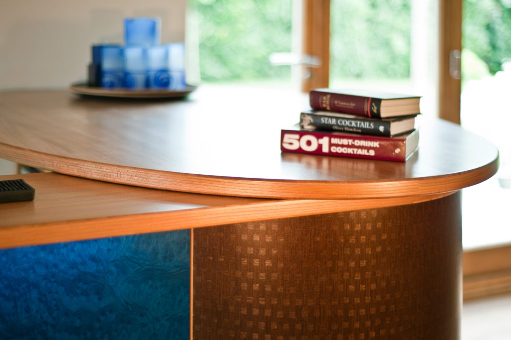 Detail of cocktail bar: elm worktop with blue-stained burr veneer and checked man-made veneered curved doors
Many people fall into the trap of thinking that wooden furniture is always brown and that the only way to inject colour is to paint it. Whilst it is true that most (but not all!) timber is of some shade of brown, modern techniques mean that it is possible to choose veneers of practically any colour and hue. There are even man-made versions which incorporate checks and stripes. We are also able to stain, wash and colour solid timbers very successfully so this is no longer the obstacle it once was.
Here at Simon Thomas Pirie Ltd, we have a very liberal attitude to colour. A quick trawl of various interior design websites will give you a wide variety of opinions as to what colours works well; in a kitchen, for example. You will have designers who advise you to have white walls with coloured units, coloured walls with white units, white walls with white units and, apparently there is something called the 60:30:10 split! We are not in the business of undermining the value of interior designers or of putting clients off using them, indeed we have completed several stunning projects alongside some very talented designers; we do however, offer our clients the possibility to throw the rule book out of the window and try materials and colour combinations that won’t have been seen in any interior design magazine because their project is entirely bespoke and unique to them.
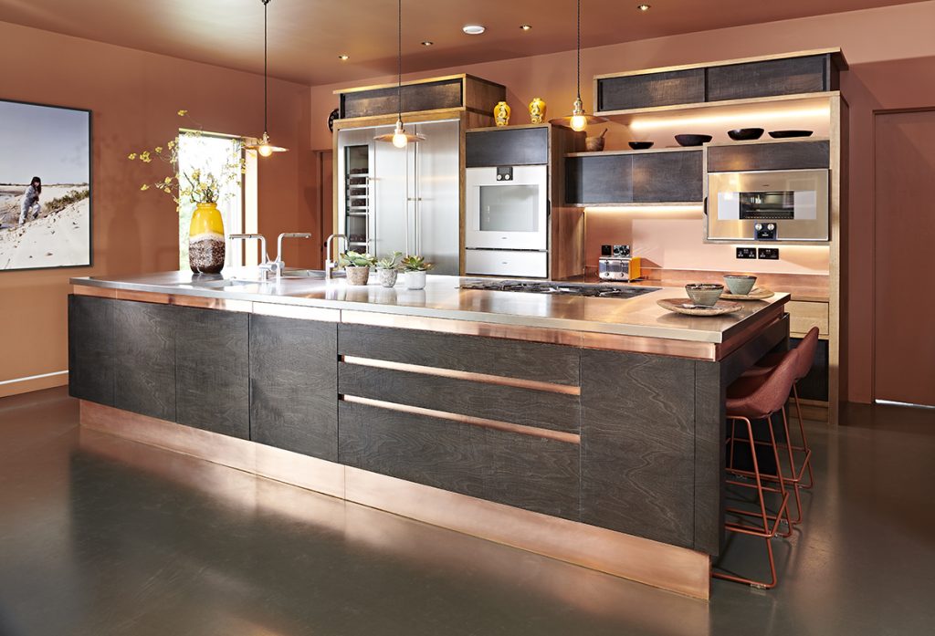
Kitchen: stainless steel island top, brushed copper reveals and kick-boards, charcoal stained ripple sycamore doors, fumed oak cabinets, walls painted in terracotta. The colour palette is subtly accentuated with innovative use of lighting.
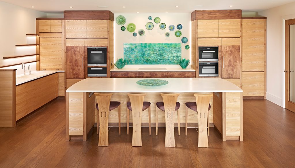 Kitchen: white Corian® worktops, elm cabinets with burr elm doors and walnut details, Jo Davis sea-green glass splashback, plates and bowls.
So when clients commission from us, the question of tone and feel of a room comes up early in the conversation. Very few have complete ideas about the colour scheme, instead they give us an idea of what they would like to achieve and we produce a series of 3D alternatives together with samples which we then talk through with the client. This discussion involves looking at the samples in natural and artificial light, putting them together with other surface samples and trying to eliminate the colours, textures and combinations which really don’t work. Clients learn that colours that they wouldn’t have put together really work, or vice versa, in the context of a veneered unit or a Corian work surface. They discover that there are a myriad more colours to granite than white, grey and black. And often their preconceptions of how neutral and bold colours combine are challenged. This process is done collaboratively with our designers as clients often discover that they are taken with colour palettes and textures which they would never otherwise have considered. The result is a truly unique materials and colours palette which the client feels comfortable and confident with and which we can then incorporate into the final design.
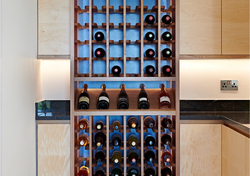 Wine rack in back kitchen area with back-lit blue birds eye maple panels again elm and sycamore cabinetry
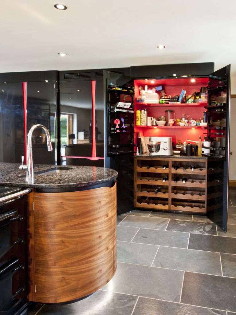 Kitchen: American black walnut cabinet doors, with dyed black veneer handle detail, black Aga, Meteorus granite worktop, gloss black larder doors with vivid pink dyed sycamore veneer interior and handle details
This approach ensures that the finished article feels holistic. Individual pieces of furniture will carry a common design theme, material or colour which guarantees a sense that they belong together as a whole and makes sure that the space flows and interacts giving understated consistency without being too obvious or fussy.