We have been busy making films again, but this time approaching it from the perspective of our clients. What’s it like to commission a Simon Thomas Pirie kitchen, what are they like to live in and most importantly to work in? In this first film we look at a black walnut and cherry kitchen we recently completed for long term clients near Salisbury. Martin and Jillian love cooking, entertaining but especially love their wine.
The space was designed not only to accommodate our stylish interior but incorporate a specially built downstairs wine cellar. On top of all that it also has to cope with the rigours of being a family space for five.
Like all our kitchens this one is full of sensuous curves, beautiful timbers and clever design features. The walnut on the cabinets runs horizontally, creating echos of the big open landscapes of the surrounding Salisbury Plain. Listen to what Martin has to say about his new kitchen as he cooks Simon a ‘quick’ lunch and opens something appropriate.
This was a really important project for us, partly because the customers are long-term clients and friends, but also because this was a test of our new project management regimes. On previous kitchens we had run over time, this was to be a trial to see how close we could stick to our manufacturing and fitting schedules. This philosophy went right back to the design stages – to designing elements we knew we could make to time and therefore to budget. Of course none of this could compromise the way it looked, like every Simon Thomas Pirie kitchen, it needed to take your breath away – proper ‘wow’ factor stuff.
The conversation started with the clients Martin and Jillian over dinner a couple of years ago. They had bought the house new and liked it, but the kitchen was disproportionally small, cheaply fitted out and an awkward wedge shape to boot. They had a growing family and loved to entertain. Martin shoots so often cooks exotic game and meat dishes, and this is all washed down with his other great passion – wine.

Although they didn’t want to spend much money, they did want to do something about it, so asked if I could just change the door and drawer fronts for something better. I don’t normally turn down work but I felt that was a bit pointless, as the layout of the room was never going to suit the way they wanted to live. Perhaps the wine helped the conversation along but by the end of the evening we were talking about creating a completely new kitchen / living space with an extensive wine cellar below. 18 months later and we were finalising designs for this stunning kitchen as the new extension was taking shape. Not a cheap or particularly quick solution, but the right one.
 The new room is 3 times bigger than the old kitchen at around 56m2, the cellar below adds another 20m2 of cool wine storage, accessed by a half step staircase. Much of the new kitchen still sits within the tapering end of the room (the red dashed lines in the floorplan above show the original wall before the extension.) Despite this the space now feels positively cavernous, with room for a generous dining table, the stair banister (both of which we made) and soft furniture. It has become a proper family area where the 5 of them spend most of their time.
There was a lot to consider in the design stages. I didn’t want that narrow end of the room to feel dark or dingy, particularly as we had decided on black walnut for the cabinet fronts, one of the darker timbers. We needed to add light and reflective surfaces to that end of the room, this was primarily achieved with a big stainless Liebherr fridge on the short end wall. It looked great and set the tone for the other appliances – the microwave and range cooker were also stainless steel.
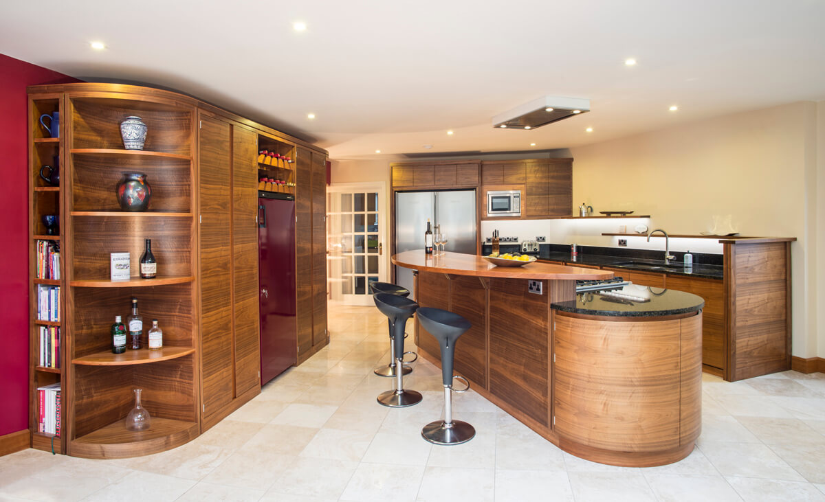
Because the main access into the room brings you into face the side of the fridge, I wanted to avoid the first impression to be one of cold stainless steel, it was meant to be a warm inviting family space. Instead what you see is a cabinet side panel with that walnut running horizontally. An elegant clock is integrated at the top, below that is a slate blackboard, then more walnut below. Invariably there are shopping lists, reminders and kids scribbles all over it. We are setting the tone. Once you are in and turn the corner, the room opens out from this, its narrowest point. It’s like the tardis!
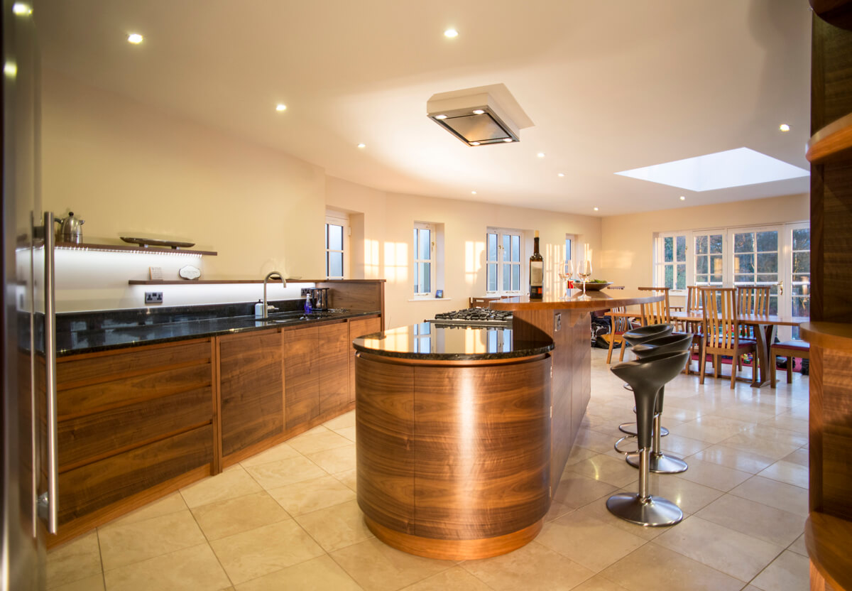
Running to the left is the fridge and a short run of over-worktop units with a built-in microwave and cupboards. Then we have a long run of very crisp looking cabinetry which includes large 1000mm drawers, the recycling bins, the sinks and integrated dishwasher. The run is all below worktop and all the surfaces are extra deep at around 750mm. The detail I love the most on this run are the floating shelves which are LED downlit giving them a lovely ‘hovering’ appearance. They also visually link the cabinets on the back (fridge) wall to this low ‘landscape’ block, stepping higher as they go.
 I use that term landscape a lot in reference to the veneer and its long horizontal and repeating grains. We ‘slipmatch’ these consecutive veneers across a series of doors and drawers, and the patterns we carefully create do become like landscapes, very apt here in the rolling plains around Salisbury. It’s a simple way of making the room feel larger.
Although the doors, drawers shelves and frameworks are in black walnut we chose cherry as the material for the kickboards and recessed handle detail. It’s a classic and subtle combination we know works. I’ve avoided using protruding handles again so nothing interferes with that crisp look. The granite is a dark Uba Tuba but on closer inspection it is full of rich green and gold tones that come alive in different lights. The floor is a light travertine, again this helps bounce a bit of light around along with a similar off-white wall colour. It’s a strong yet subtle palette of colours, tones and textures.
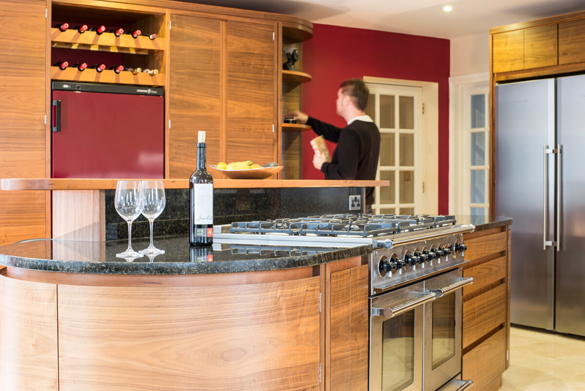
The island is obviously central to the space, visually, practically and emotionally. Again those long landscape veneers wrap right round the two d-end cupboards. It’s almost boat like. All the curves within the kitchen also aid flow around space. As I said earlier cooking is key here, so it’s no accident that the generous Rangemaster Continental range cooker ends up here in the island. No accident either that the bar area is designed for the cook to be facing those seated guests, so conversation, drinking wine and eating entrees continues through the food preparation. The solid 3 metre cherry bar top is elevated above the granite worksurface, it’s a well used busy place by kids and grown-ups alike. The island contains plenty of storage in those vast semi-circular end cupboards. To the left of the range are two pull out spice and bottle racks (ideal for oils, vinegars etc.) To the right is another very large 4 drawer stack, for everything from cutlery to utensils, to the obligatory pan drawers. It’s a cooks area, with everything close at hand. Turn around – the sinks, bins, dishwasher and other 4 drawer stack are right there.
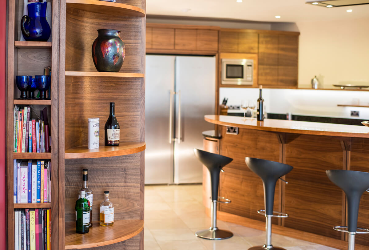
 To the left of the island from the narrow end of the room are all the tall units, connected into one long symetrical run. Right at the centre of this is another Liebheer fridge, but this one is specifically for wine, along with the bespoke bottle racks above it. The deep red colour on this appliance is echoed in the wall colour on that side of the room. It’s a nice touch that just seems to give the space a bit of oppulence. On either side of the wine fridge are almost floor to ceiling larder storage cupboards cabable to taking a huge volume of stuff. One is fitted with a mix of full and half depth shelves, the other has deep storage drawers with shelves above. At each end of the units are quarter round shelves to create soft display. Tucked right in against the wall are a narrow bookshelf at one end and the broom cupboard at the other. These kitchens are practical as well as beautiful!
This kitchen comes closest to a kitchen I’d want myself in terms of elegant design simplicity, warmth, practicality and sociability. It works, i’ve experienced it, which must be the ultimate test for any designer – to be in the space you designed being entertained, wined and dined. Martin put it beautifully when I asked if there was anything he’d change now; “the kitchen is perfect, everything is just where I want it, I wouldn’t change a thing.” Mind you it was after a few bottles of very good wine!
There are images of what the previous kitchen looked like if you are feeling brave enough! Just click here. As part of the same blog story there is also a sequence of images of the kitchen being fitted, taken from the same place. It gives a great insight into how much care we put into fitting our bespoke cabinet work.
If you’d like to talk to Simon about a kitchen project please get in contact, initial conversations and ideas cost nothing. For more of our kitchen case studies click here.
All images taken by Double Exposure Photographic