 Simon Thomas Pirie have been involved in some pretty amazing projects over recent years from central London apartments overlooking Big Ben to very contemporary homes on the wild north Norfolk coast.
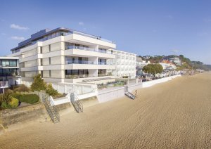
But this project is much closer to home, on a very different coastline with a very different brief: This is Sandbanks near Poole, playground for millionaires. The ‘Ace Penthouse’ occupies all of the 5th floor of the new build block with roof gardens above giving you 360 degree view of the peninsula. It is of course higher than anything else! Looking out to sea over some of the best sandy beaches in the UK with uninterrupted views from old Harry Rocks across Bournemouth Bay to the Isle of Wight. On the other side of the building and you look out over Brownsea Island and Poole Harbour, the largest natural harbour in Britain.
This is another of our collaborations with WN Interiors, a south-coast based interior design practice who do exquisite work. We love working with them as there is a huge amount of mutual respect and creativity which reflects in the work we make. We also worked very closely with the developers – Westcoast Developments who were the third contributor to the mix. Of course the real advantage of working within a broader design team is that ‘no stone left unturned’ outcome, where all finishes across the furniture, joinery, floors, walls and soft furnishings are considered and complimentary. That really shows on the Ace Penthouse project.
We were asked to look at elements in the living room, study / night sitting room, master bedroom suite and the other 3 bedrooms as well. We also ended up making the bespoke skirting boards and architraves for the whole apartment. Unusually for us the only area we didn’t play a part in was the kitchen.
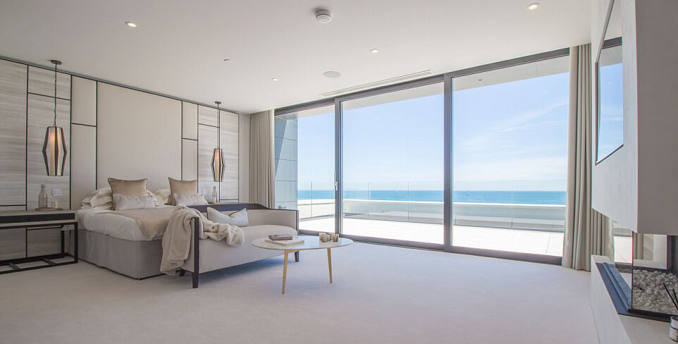
The master bedroom suite comprises of the master bedroom, the en suite bathroom and a dedicated dressing room. Our interventions in the bedroom are minimal but visually important in the form of the geometric wall panels that create the theme and a repeat pattern in the space. They are also offset from the wall so give the opportunity to back light with LED’s to create halos of light and make the panels appear to float.
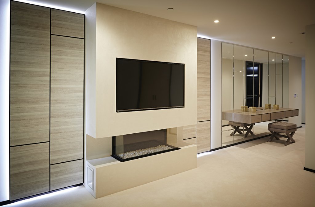
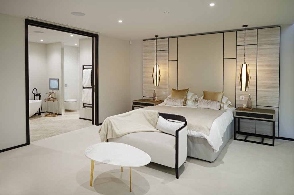
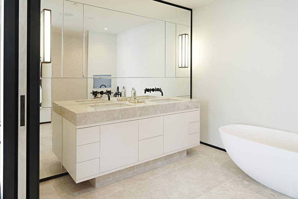
The panels either side of the fireplace and leather bed headboard carry a horizontally natural textured paper which is geometrically framed by a thin 10mm dark oak framework. The same dark oak is used on the skirtings and architraves in this set of rooms uniting them with these formal lines. This can be seen running through the ensuite where we made the cabinetry for the sink unit and mirrored wall behind. That unit in a white birds eye maple contains drawers and doors and again plays with the rectangular geometric shapes in the wall panels. That is also reflected (no pun intended) in the detailing of the mirror wall behind.
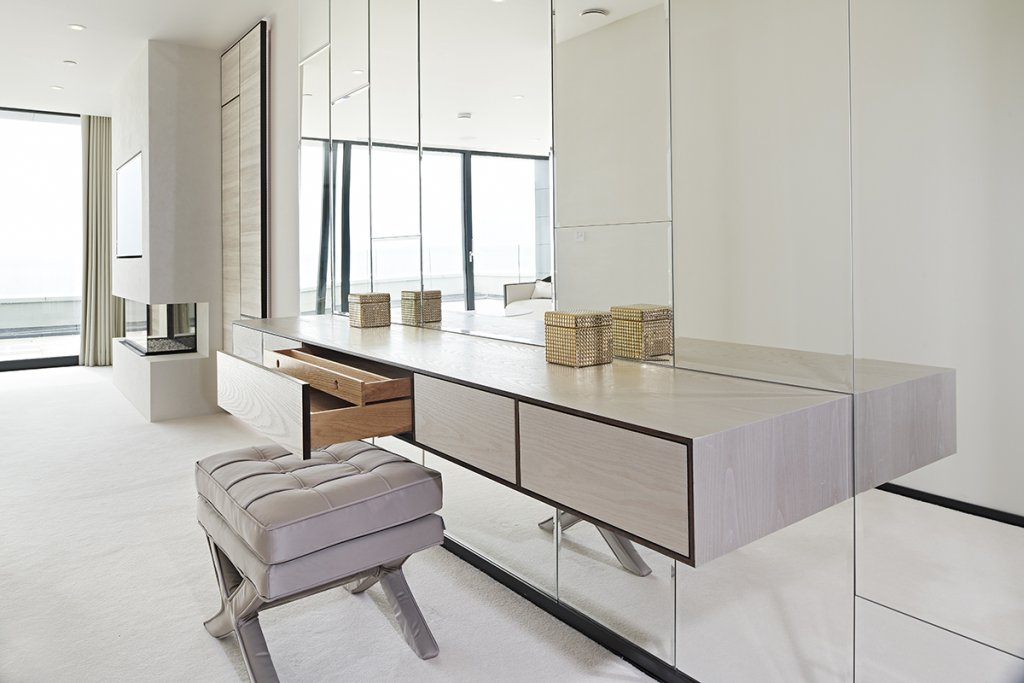
I think my favourite area in the master suite is the floating dressing table. This is also surrounded on all sides by more geometrically divided mirror panels helping to create that floating appearance. This single strip of drawers is finished externally with a crown cut grey sassafras veneer, it has a dark oak on the front faces. The dressing table occupies a wide corridor between the main bedroom / ensuite area and the dressing room and lobby. The mirror wall helps to create extra light and reflection in what might otherwise be a dark and under-utilised area.
The dressing room is accessed through a pair of sliding pocket doors. Unlike the rest of the master suite this is a moody dark space with no natural light, however that’s more than made up for by the lighting at the front of the dark oak dressing room cabinets and in the feature bag and shoe shelves of the back wall which are glazed and under-lit. 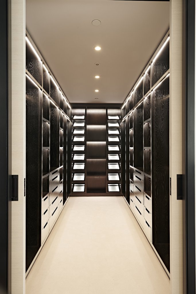 That draws you in and creates a depth and focal point to the room. The symmetrical cabinetry on either side is full of drawers, shelves and hanging spaces. The colour of the cabinets in this space is that same very dark (almost black) oak we used in the frame edges and skirtings elsewhere. The texture of the grain shows though so it is far from a flat dull surface despite its darkness.
The gold hardware creates a nice contrasting feature and let’s face it, a bit of bling!
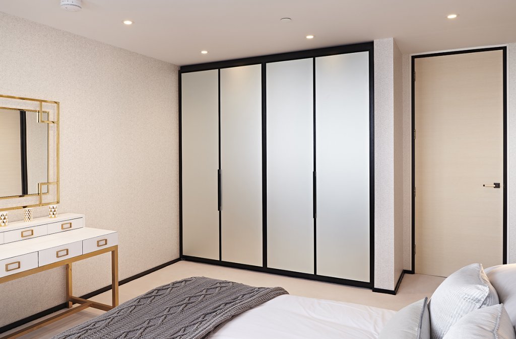
There are 3 other bedrooms in the apartment all of which had fitted wardrobes made by us. Although all of them had different finishes on the doors – some with etched glass, some with silver mirror glass and some with textured plaster panels we used the dark oak for the carcasses, door frames and handle details.
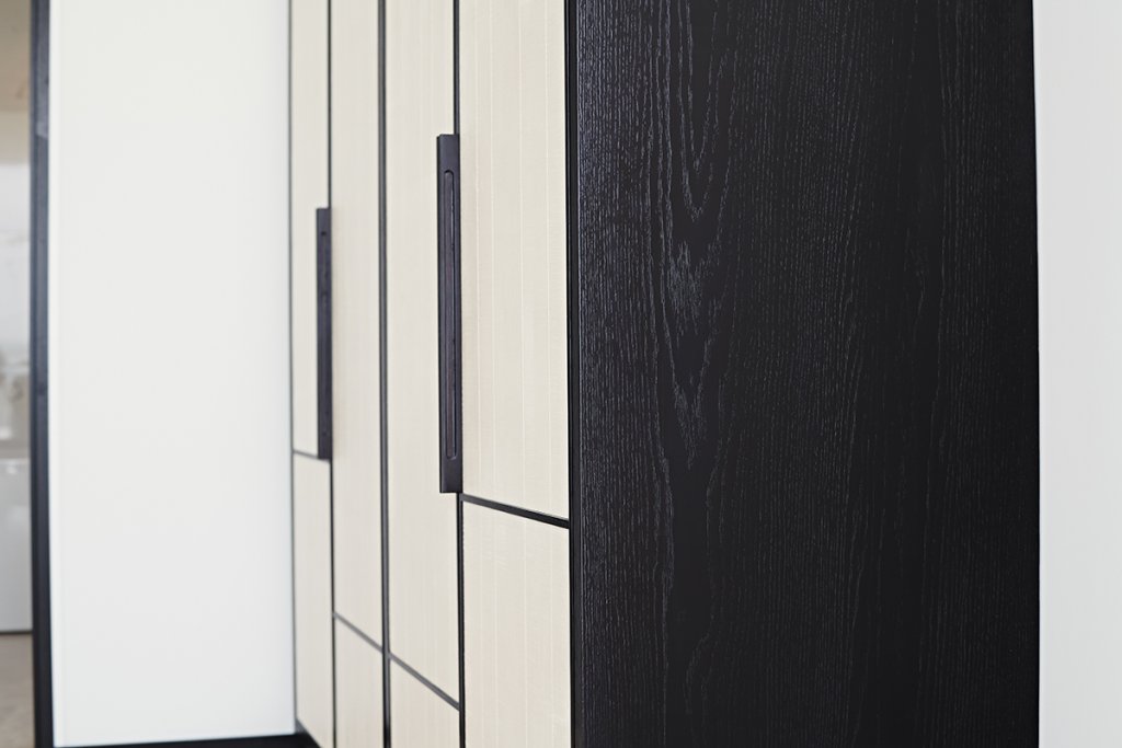
That dark oak really is the thread of consistency through the whole scheme, as is the horizontal divide line we used again in the guest bedroom wardrobe doors – a detail brought over from the panels in the master suite. 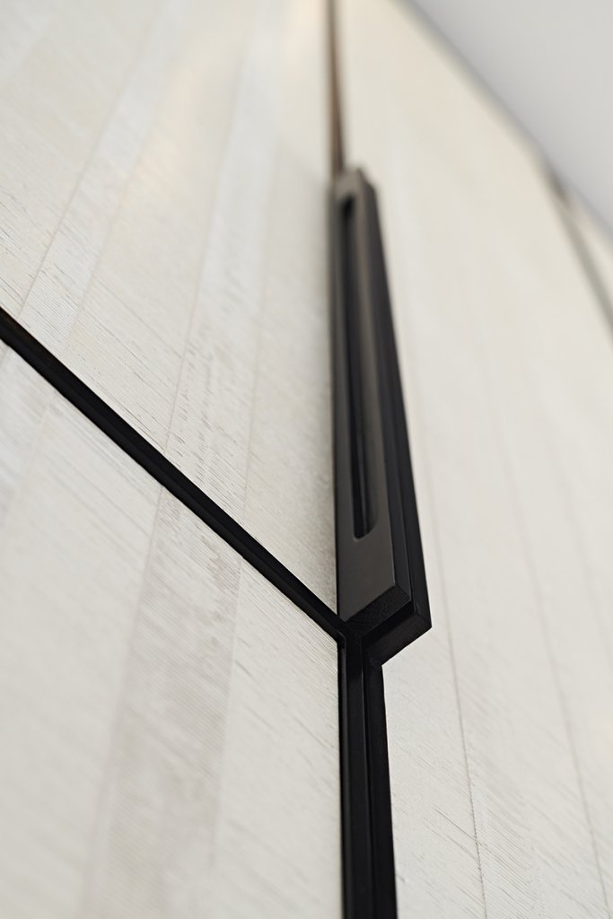 I mentioned the textured plaster panels earlier, these are a slightly off white colour with a rythmic but slightly organic texture by polished plaster specialist Armourcoat. This particular product was called ‘Volcini’, one of the many textures and colours they offer as panels and wall finishes. It works beautifully with the contrasting dark oak frames and handles.
We explore more of the issues in bedroom design through a variety of past projects including the age old question of fitted vs freestanding furniture in our Designer’s Notebook story – click here.
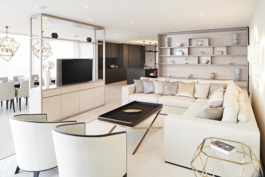
There are two living spaces in the apartment, each with it’s own distinctive character and even a time of day when best utilised. For the sunny daylight hours the open kitchen / dining / living space is the place to be. It’s the largest space in the building which opens out on to a large balcony through glass walls on two sides making it feel even larger. The view from the space overlooks the famous Sandbanks beach with longer panoramic views over the Purbeck hills, the Isle of Wight and the Bournemouth seafront.
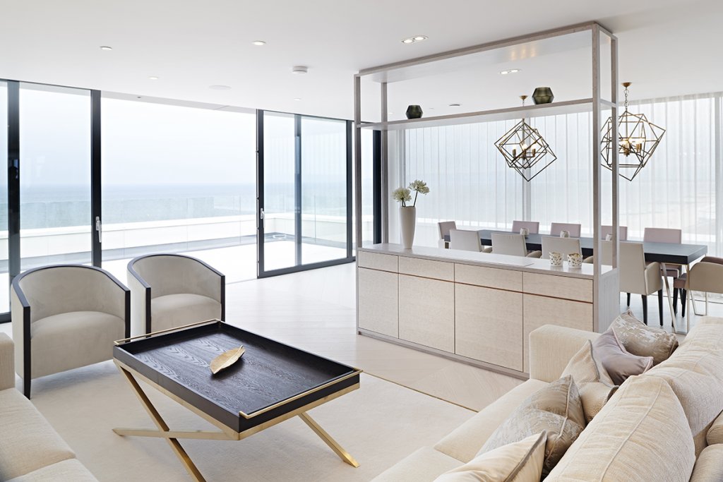
It’s the large display cabinet and room divide that are our contribution to this area. They both define the space and sub-divide it, create storage opportunities and hide a TV lift for a large format flat screen TV. Materials wise we used a subtle combination of light shades – a pearl white figured eucalyptus on the doors and back panels with a more neutral mid-grey ripple anegre for the frames and shelves. There are darker detail lines in walnut which is also used in the cupboard and drawer interiors for contrast.
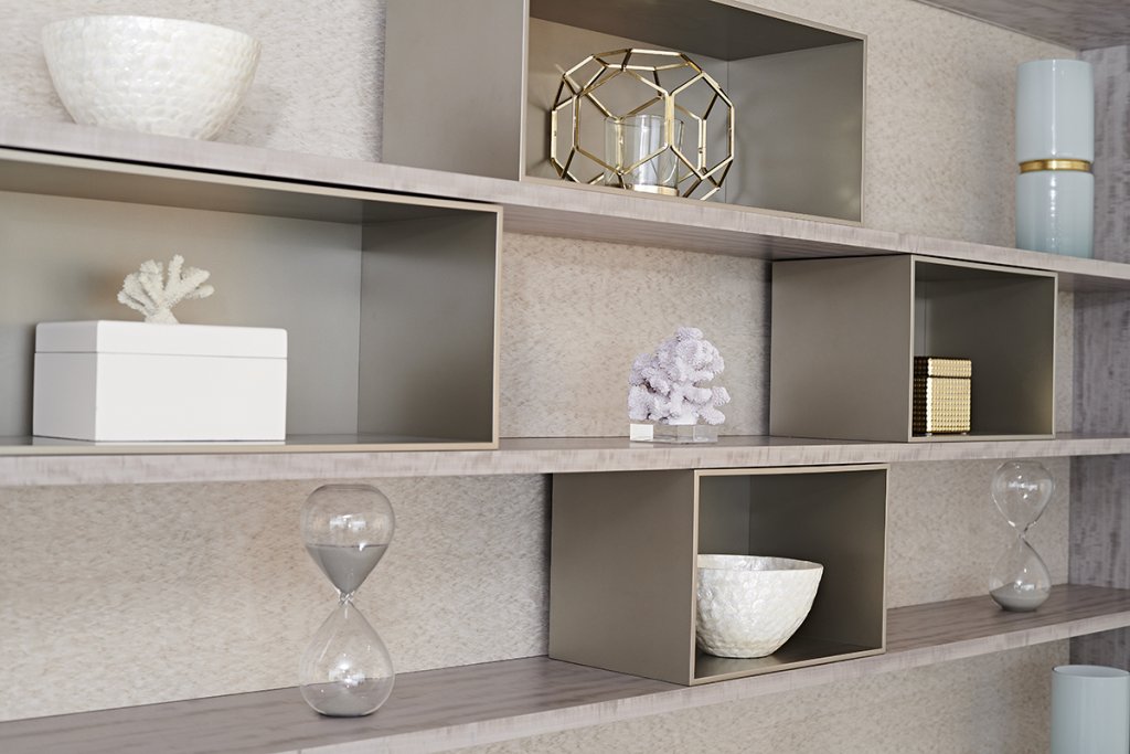
The wall unit shelves are lit with hidden LED strips and are visually broken by silver lacquered metallic boxes breaking the long 3m plus width. It’s also worth pointing out that we had to build in vents top and bottom in this piece to allow for an air conditioning built into the wall. We have to take M&E considerations like this into account often and have become adept at hiding these mechanisms without compromising the look of the furniture. Again this is where good design work comes into play between architect, developer and interiors teams.
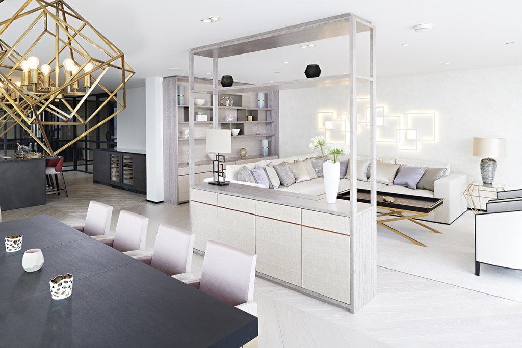
I’ve saved my favourite room and furniture piece till last though. This is the darker, moodier, night study / living space. Perhaps it’s also more of a winter space as well with a large built in fire place. Saying that it does also have sliding glass doors to a balcony overlooking Poole harbour, which is a stunning view in its own right.
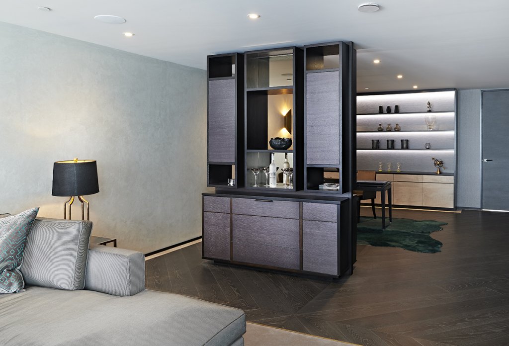
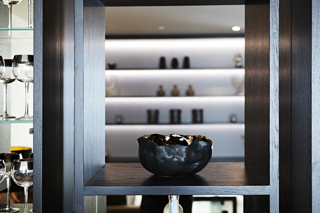
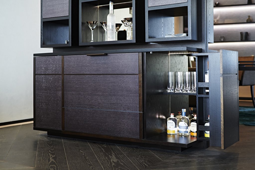
The room is part cosy night-time lounge, part bar and part informal study. Our contribution like in the other living space is manifested in two large pieces – a storage and display cabinet against the back wall and a room divide storage cabinet and bar. We are back to our very dark oak finish here on all the frames, shelves and panels with a grey figured ripple sycamore on the doors and drawers and a stunning blue and silver textured paper product by Elitis in the back panels. This comes alive with the back wash LED lighting within the units. There is also another charcoal textured oak finish on the doors of the sitting room side of the bar unit to differentiate this ‘bar’ side of the unit from the study side.
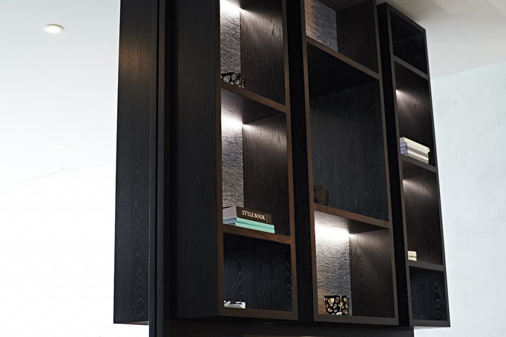
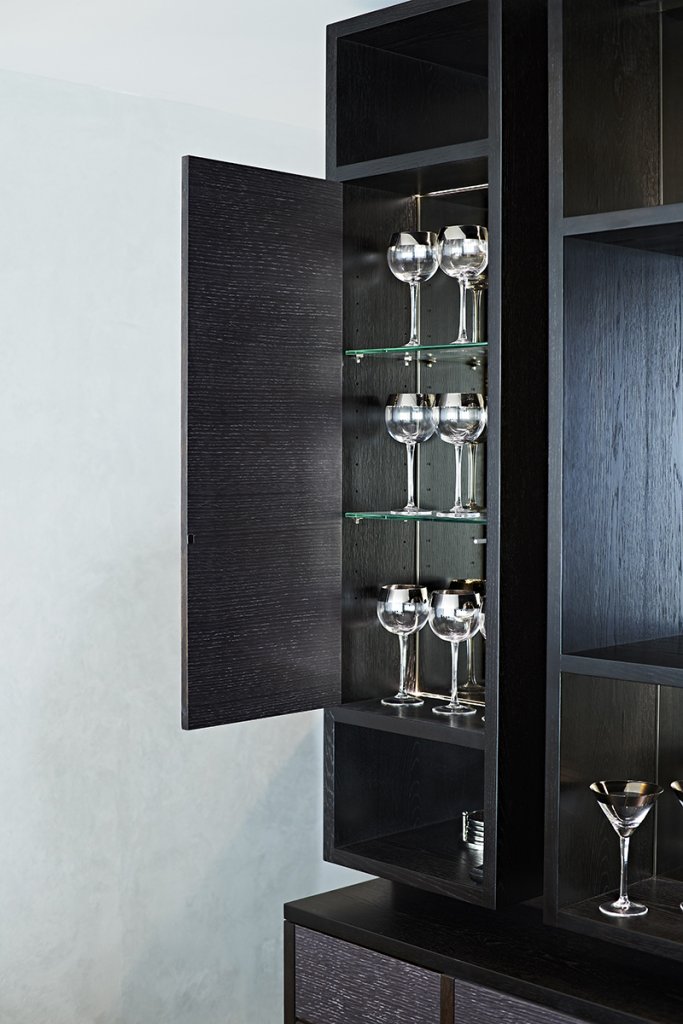 This is my favourite piece in the project, but also one of my favourite pieces that we’ve ever made. I can’t even take all the design credit on this as it was very much conceptually a WN Interiors idea, worked up by us. There is a lot going on in this lovely piece of furniture, although at first it looks solid actually the top sections are pierced by some alcoves so you can see though from either side. Some of the alcoves on both sides are mirrored, some have the textured paper back and some have doors on. The whole cabinet is contained within a floor to ceiling framework which in turn is divided into irregular geometric rectangles, it is the consistent theme throughout the whole apartment and is probably best expressed through this piece.
The bottom cabinet section on the bar side actually contains a large Fisher & Paykel ‘Cool Drawer’ in the centre for cooling bottles. On either side of that are full corner opening doors for spirits and mixers with mirrored backs creating visual depth and interest.
I love the contrast of this night space to the airy seaside lightness of the kitchen living room on the other side of the building. I’m also really pleased with the success of the room divides in these spaces. It can be a difficult balance to strike putting a piece of furniture into an open plan space to visually divide and separate key functions whilst keeping the sense of generous openness. Using furniture to do this instead of a wall can be really beneficial as you also potentially gain functional uses to both sides like in the case of the bar / study piece.
Ace was one of those important turning point projects for Simon Thomas Pirie where we were a key part of a larger design team, really looking at a project in a much more holistic way. There was a time when we might have ignored the skirting and architrave elements for example, but this simple and unglamorous element went on to unify the spaces, creating a crisp detail theme and colour for the whole penthouse.
It’s probably worth saying the Ace Penthouse in Poole was designed speculatively, as a luxury space to appeal to sell to a very wealthy audience – probably as a second home. At the time of writing it was still on the market and had recently appeared in ‘Harry Rednapp’s Sandbanks Summer’, an ITV series focusing on the Sandbanks lifestyle, but this Lloyds Estate Agents video probably shows it better…
It’s a big price tag, but it is pretty unique and probably worth it for the furniture alone!
Written by Simon
Images By Double Exposure Photographic